

Cover Crazy is hosted by The Book Worms. Each week, bloggers "admire the art and beauty of a book’s design, so I’m going to post minimal words. It is up to you to write how you feel and what you like about it the way you’d like to."
Have you guys noticed the latest Dystopian sub-trend taking place in spacecrafts? Across the Universe by Beth Revis debuted in January and Outside In by Maria V. Snyder came out earlier this month. Next up, we have Glow by Amy Kathleen Ryan, out this coming fall. What do you think about this trend? I still tend to think of these books as sci-fi despite the rise against the government. Maybe it's just me? After all, the last book I read *was* Outside In, so maybe it's just on the brain... But the more I think about it, the more I think it's a new trend!
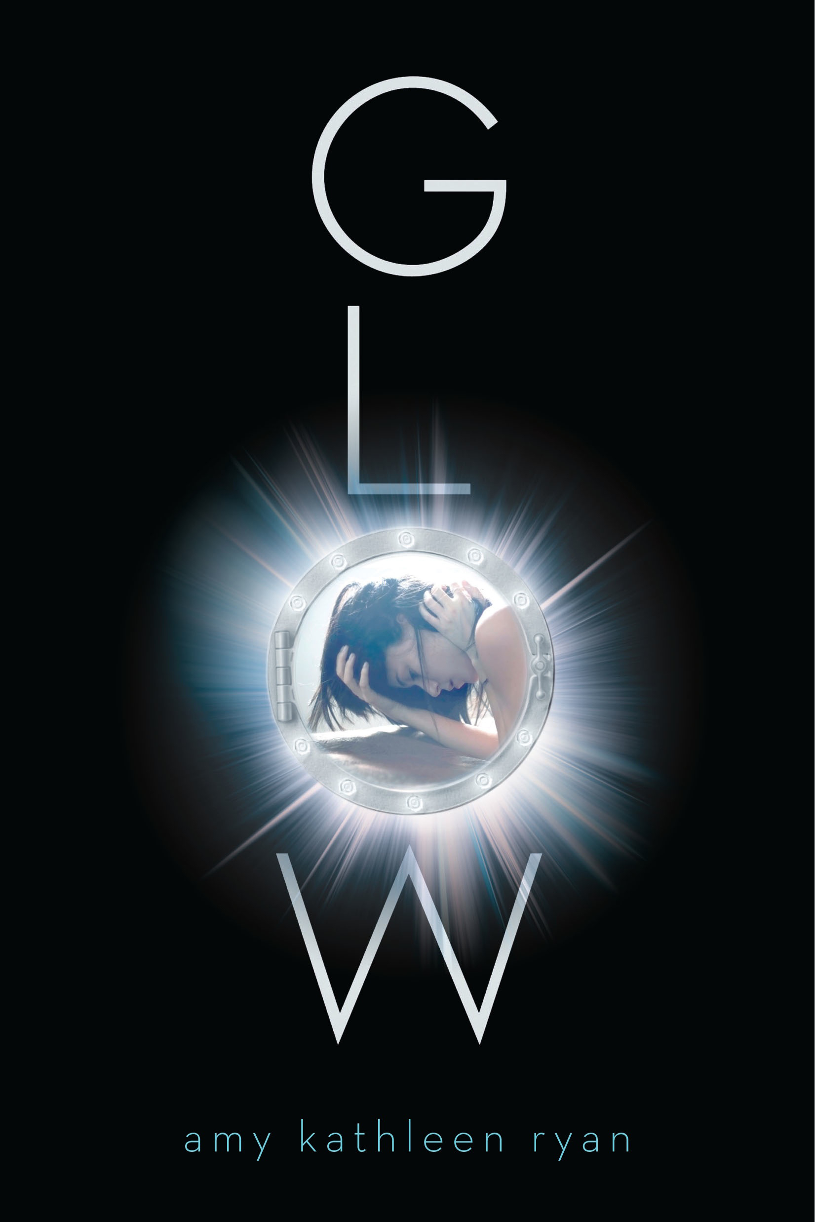
Anyway, the cover for Ryan's Glow is made of awesomesauce and you should all drool now:

Why I Love This Cover:
Glow hints at its sci-fi roots. Originally, I thought the the "o" was just an "O" with the picture inside. However, upon looking at a huge version of the cover on Ryan's site, I realized that the "O" represents a spaceship window. How cool is that? Plus, I love how the image, um, glows. I love how sturdy the typography is--All you need is that glowing "O" with the cover art inside it.
The spherical shape reminds me a bit of Matched by Ally Condie, and the "girl inside the image" reminds me of something else coming out soon, but I can't think of what or by whom. I'm horrible. I want to say it's a cell phone on the cover, but I think I'm wrong. I might also remember the object being purple...? Anyway, whatever the book is, it came to mind. But Glow is also holding its own. I LOVE the fact that the whole image is inside one letter of the title. How awesome is that? Plus, look at the girl! Doesn't she look upset? Looking at the summary on Goodreads, the storyline has a faint trace of Wither in it, so perhaps she's upset because she doesn't want to be married so young? I come up with so many situations in my head and just want to know WHY she looks like that. It's enough to make me want to pick up the book. Then again, whatever she's lying against doesn't look very comfortable. Maybe she's just upset it isn't soft. ^.~ (I jest.)
Anyway, total cover love here!
What do you think? What cover are you crazy about this week?
[Glow is scheduled to hit a bookstore near you on Sept. 27, 2011.]
This is awesome! I can see the comparison to Matched with the girl inside the window. She almost looks like she's curled up *edit* just read the blurb, looks like she's in a womb!
ReplyDeleteThis sounds like Across the Universe and Wither got together and had a baby. Cool!
Agreed! This cover is awesome in so many ways. I'm really drawn to it and now I want to read the book. Great pick this week.
ReplyDeleteOh wow, great find!
ReplyDeletel agree with Laura it kinda makes me think of Matched BUT stands out on it's own.
I'd never seen this cover before! It looks really cool!
ReplyDeleteThat's an awesome cover! It makes you want to read the back cover to find out more.
ReplyDeleteLori @Romancing the Darkside
Really great find! The cover is gorgeous and simple which is really nice.
ReplyDelete@Laura: That's just what I was thinking! It's totally ATU and Wither's baby!!!! And you're right, it could be like being curled inside a womb. Ah, symbolism!!
ReplyDelete@Gina: This is totally one of my favorite covers in a while. It's so nice and clean...and still eye-catching!
@BooksforCompany: I know. My first thought was Matched, but it's unique enough that it stands on its own. I don't think it was copied at all. They're just similar.
@Kayla: Right? SO cool! I love how the *entire design* is inside a letter of the title. So unique!
@Lori: After seeing this cover for the first time, I ran to Goodreads to see what it was about! Almost as good as reading the back cover, ne?
@Vy: Yes, that's one of the things that draws me to this cover. It's so simple and clean, yet still so eye-catching!
You're right, it does remind me of Matched by Ally Condie. I think what's also great about this cover is the stark contrast between the black of the cover, and the 'glow' of the title and image. Defiantly a cover well deserving of some cover love!
ReplyDeleteGreat analysis. I also didn't notice that the O was more than an O at first. I love Amy Kathleen Ryan and had not heard about this book. It is now on my TBR list.
ReplyDeleteReading Lark's Cover Crazy